Case: Application Redesign for NIC, Inc. (2021)
Gov2Go Application
Re-imagining Gov2Go
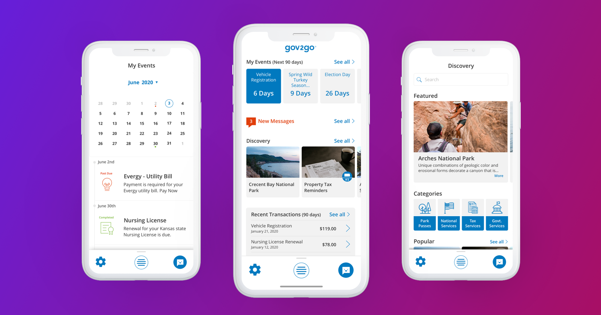
NIC Inc. is a digital government service provider serving federal, state, and local governments across the United States. Their services encompass the collection of various service fees, including permit fees and license renewals. Introducing Gov2Go – the emerging flagship application from NIC Inc. Gov2Go serves as a comprehensive marketplace for government products and services, streamlining citizen access to essential government transactions and payments through a single, user-friendly platform.
The Mission
Gov2Go was initially launched as a Minimum Viable Product (MVP) and made available on a limited basis to select states. Both before and after its redesign, Gov2Go has functioned as a hybrid solution, offering users access through a responsive web-based platform as well as native mobile applications. This dual approach ensures broad accessibility and a seamless user experience across different devices and operating systems.
The Redesign aimed to elevate the platform by creating a more robust and powerful system that states could utilize effectively for their citizens. This case study examines two key components of the redesign:
Navigational Structure
The revamped navigational structure was designed to enhance user experience by simplifying access to essential services. Clear categorization, intuitive
menus, and streamlined pathways reduce the time and effort needed for users to find information. The structure supports scalability, allowing states to customize navigation without compromising usability.
Overall Look and Feel
A modern, cohesive visual identity was established to improve engagement and trust. The design employs a clean, minimalist aesthetic with consistent typography, color schemes, and iconography to promote accessibility and readability. Responsive design ensures compatibility across devices, providing a seamless experience for all users.
Together, these improvements solidify the platform’s capability to serve diverse state needs while prioritizing citizen accessibility and satisfaction.
The Problem
When I began working at NIC Inc., they were experiencing a period of growth in their market space — the world of government transactions. NIC wanted to leverage its Gov2Go application and go a step further allowing users to locate and pay for government services at the federal, state, and local levels.
However, there was work to be done on the current build of Gov2Go. The navigation was reported by users to be disjointed and confusing, and the system performance was sluggish at best.
A number of usability issues were discovered, such as not being Section 508 compliant. The NIC design team needed to prioritize a list of problems and build out a plan to redesign the pre-exisiting system. Some of the methods we used for this included conducting a heuristic review and a usability test of the current build.
Since our mission is to provide access to government services with the tap of a button, the design team decided to hit three things out of the gate: 1. Work with developers to get the system performance to an acceptable level; 2. Design a more intuitive navigation that is both understandable to the user and scalable in the future; and 3. make a system that is accessible to all users.
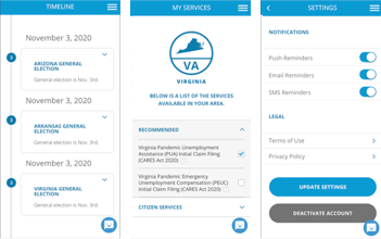
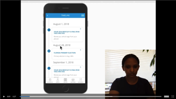
V.1 Gov2Go screens for Timeline, My Services, and Settings
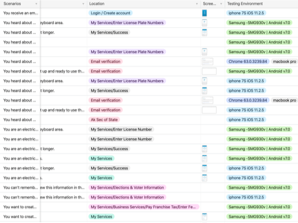
A table used during our heuristic review
Teams & Roles
Based on my experience designing web-based and native applications from the ground up, I led a core team of three designers. We collaborated closely with cross-functional teams, including internal engineers, QA, business, and marketing, to ensure a cohesive and well-rounded product development process. This multidisciplinary approach enabled us to align design goals with technical feasibility, quality standards, and market needs, resulting in efficient workflows and successful project outcomes.
I coordinated and led all facets of design, including information architecture, user task flows, interaction design, visual design, product development, and prototyping. I also conducted research using methods such as interviews, surveys, focus groups, and participatory design to address both user behavior and attitudes. Since our team worked partially remotely, much of our collaboration took place via Slack and Zoom meetings; however, every three months, we met in person at the home office for several full-day cross-functional sessions.
User & Audience
Gov2Go is an application that is available to all citizens of participating states. We had many different types of users we needed to consider. The design team looked at typical use patterns such as mobile vs. non-mobile usage patterns. The Gov2Go user (based on three Citizen User personas) are professional/ para-professionals who are on the go throughout their week and have a strong preference for mobile-first, fast, real-time communication.
Emails and websites are not enough, they need their devices to work for them (augment their day-to-day routine).
We found that the majority of users of Gov2Go use iOS devices. Further, we learned that most transactions, in participating states, leveraged the app to renew vehicle registration first and renewed a professional/ vocational license second (e.g. RN Nursing License in Arkansas).
Design Process
In order to identify if this product needed a redesign or a complete rebuild, as well as what the app needed to accomplish, our cross-functional team began by assembling a focus group. After sifting through all of their feature requests, we were able to identify key pain points: users wanted an easier way to locate an item (service and/or product), purchase that item, and be able to locate the record of the transaction..
Based on this feedback and current timeline and budget restrictions, we decided on a redesign. Although we knew that Gov2Go could grow to something much larger and more robust, we focused on creating a V2 that met user’s core needs based on feedback.
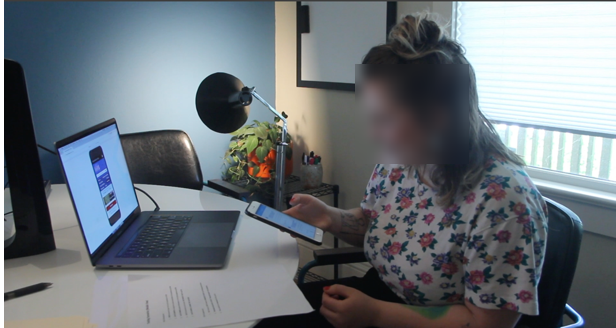
Task analysis underway
More task analysis
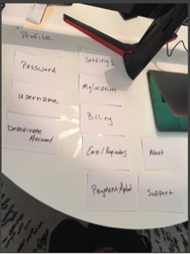
Card sort
We identified the key specs that had to be included in the app in order to build a V2 for our redesign, then mapped out the user flow based on those specs (tons of whiteboarding). At this point in the process, we found participatory design to be extremely helpful. We had end users mapping out their ideal flows, which we were then able to incorporate in our designs. Based on the user flows, we constructed the information architecture so that there was minimal friction for the user in immediately accessing relevant information. After all, the goal of this product is to allow users to quickly and easily locate an item, pay for it, and if necessary, access transactional information with ease.
A flattened experience
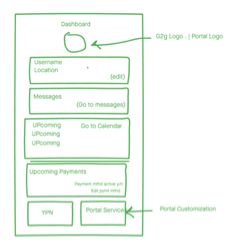
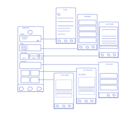
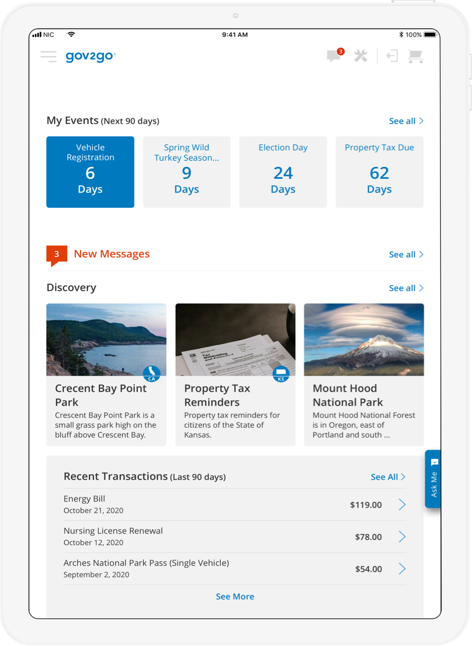
The dashboard becomes the hub of the application
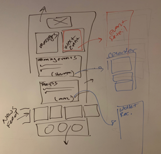
Quick concept iteration based on above whiteboard sketch
Making the connections on how this concept would enhance the user experience
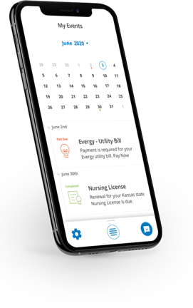
As we started to explore the interface and visual design, we discovered that we needed to make changes to the navigation structure. The team brainstormed using a variety of tools, such as crazy-eights and typical white boarding, in order to rapidly iterate on a wide variety of ideas. Because the central components of Gov2Go’s experience is event management and service fee transactions, we decided to move our navigational model to a hub and spoke by integrating a central dashboard.
UI Design
The objective of the representational model for this interface is to keep the app fun and unique, yet keep an air of ‘officialness’ to the user experience. This was accomplished through the use of slightly round corners, vibrant service and product images, playful icons, and a purposeful use of color.
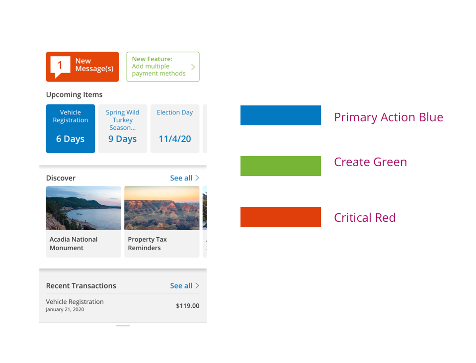
The colors used in the redesign have clearly defined meanings that fit within our user groups perceptions of what is ‘new,’ what is a ‘primary action,’ what are ‘critical errors,’ and what is a ‘destructive action,’ etc.
Early Dashboard iteration of a redesign screen using the new colors
Much of the visual design elements we acquired from the previous version had significant usability issues and were not Section 508 compliant. Color and contrast ratios fell far below usability expectations, so we re-factored our colors, among other things, to meet the AAA requirement.
Responsive Design
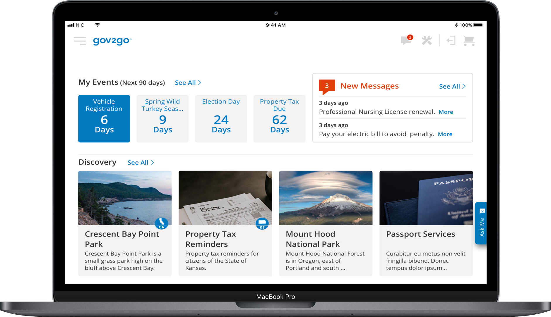
Gov2Go is a product for local and state governments, as well as federal agencies. It is a platform that provides access to products and services for citizen users. Because our mission is to provide strong adherence to Section 508 standards, as well as being device/ platform agnostic — users can access their government products and services with no barriers. Gov2Go is a responsive, web-based application that gracefully scales to users’ devices, thus allowing them access to critical government services.
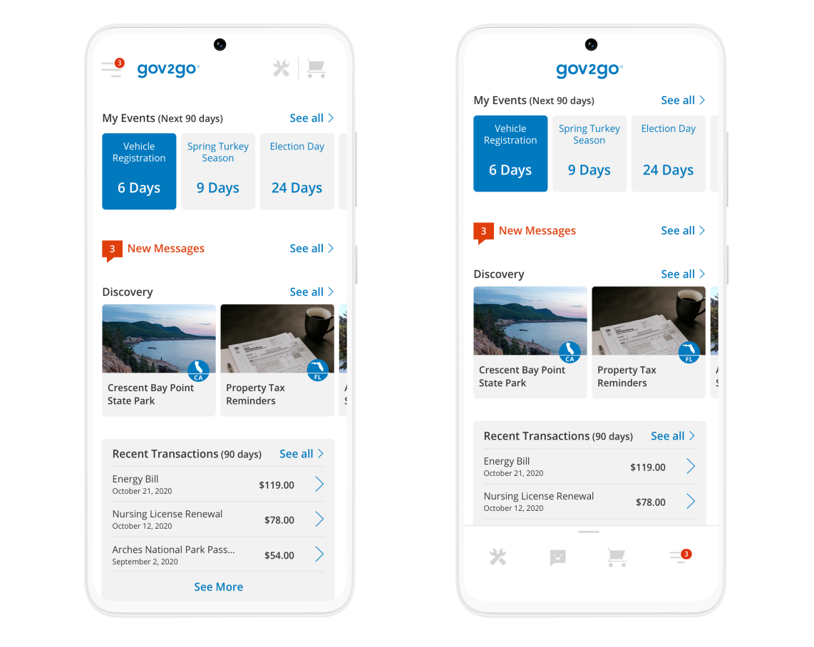
A grid system and accompanying media queries helped accomplish this mission requirement. As a team, we chose these media queries based on popular devices:
Web Small (4 Col) (<576px)
iOS/Android Native App - Xamarin build derived from Web Small
Web Medium (8/12 Col) (576-768px)
Web Large (12 Col) (769-1199px)
Web XLarge (12 Col) (1200+)
Web Large (12 Col)
We implemented a grid system that applied variable units within the grid. The grid used variable unit/width (%) columns along with fluid units (ems). Although the layout was adaptive, the components themselves were fluid.
Web Medium (8/12 Col)
Left: Web Small / Right: App Build (4 Col)
Interaction Design
In order to reinforce the fun and friendly tone that was established for Gov2Go, we used a mix of iOS conventions, a Material inspired interaction model, as well as fun, springy, but subtle, animations. Even though the Gov2Go redesign is still undergoing development and beginning its UAT phase and limited release in select states, the cross-functional team found the high-fidelity interaction prototypes to be extremely useful in gathering valuable team feedback. So far, the results of user testing indicate an overwhelming positive response.
Another by-product of this project was that it initialized a new mobile product design and development process within the company that ultimately helped it to take on new mobile projects. For example, Gov2Go is now being leveraged with additional features for Covid-19 response in several states.
Gov2Go’s interaction model is inspired by Google’s Material Design. The application background is white, which remains constant. Anything that appears in “Primary Action” blue signifies action/ navigation. We also used other colors, icons, and animations to keep the user oriented within the application.
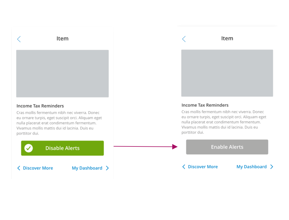
Enable user to set an alert with a single touch
The Outcome
The application was well received within the company and by users. While it has only been partially released to 27 select states, it has already increased communication within the company.
