AEP - Cohort Definition Feature (2023)
Aetion, LLC
Substantiate is an advanced analytics application that enables users to assess the safety, effectiveness, and value of medical technologies. Widely used by global biopharma organizations, regulators, payers, and health technology assessment bodies, Substantiate generates decision-grade studies without compromising transparency or reproducibility.
I was the senior UX designer for Substantiate at Aetion. My specific project was as design lead for an advanced cohort definition workflow. This workflow is critical for future product features that will require this enhancement, such as pre-balancing for regulatory grade analysis plan work, leading to objective guardrails — an FDA initiative that promotes transparency, audibility, and overall study blindness during study design.
Cohorts and Cohort Definition
Problem: Design needed to simplify the current workflow in a way that would allow users to work in any direction and not be bogged by previous decisions. This means understanding current user standards, professional best practices, and building out a user flow that meets those strenuous requirements. Since Substantiate is a very technical application that depends on keeping up with scientific nomenclature and workflows, we conducted several rounds of user interviews, both internal and external, to make sure all design decisions were appropriate. In Q3 2022, this project was highlighted as a top priority on the roadmap and was requested to be completed by the end of Q2 2023.
Cohort Definition - Usage
In many cases, epidemiologists (users) find themselves redoing work because the system does not afford the ability to move back and forth.
Design Process
-
To learn the objective, we had a kickoff meeting that included all of the stakeholders for this project. During this meeting, we were provided the PRD and discussed the overall objectives and requirements necessary for success.
Project Manager
Product Designer
VP of Product
Founder (of Aetion)
Director of Science (Engagement)
-
Once requirements are understood, I worked directly with the Product Manager to better understand users. This included 8 individual user interviews and one workshop.
-
When the product owner and myself understood what the areas if concern were, we started building user flows in Figjam from a high level, then eventually getting into the weeds to address the use cases. In this particular project, this was the longest phase. We were creating task flows, then validating those flows (our assumptions) with users (internal users ).
-
Even though engineering was a large part of the cross-functional design process, this phase is critical once we had appropriate possible solutions for the cohort definition workflow.
-
Design took off once we had signoff for possible solutions, in this case workflows. After our workflows (Figma) were created, we took those to internal users for evaluation to validate our solutions — of course keeping an eye on any fail points in the ux.
-
After user validation and stakeholder signoff, the cohort definition work was placed into both a design sprint cycle (2- weeks ahead) and concurrent engineering sprint.
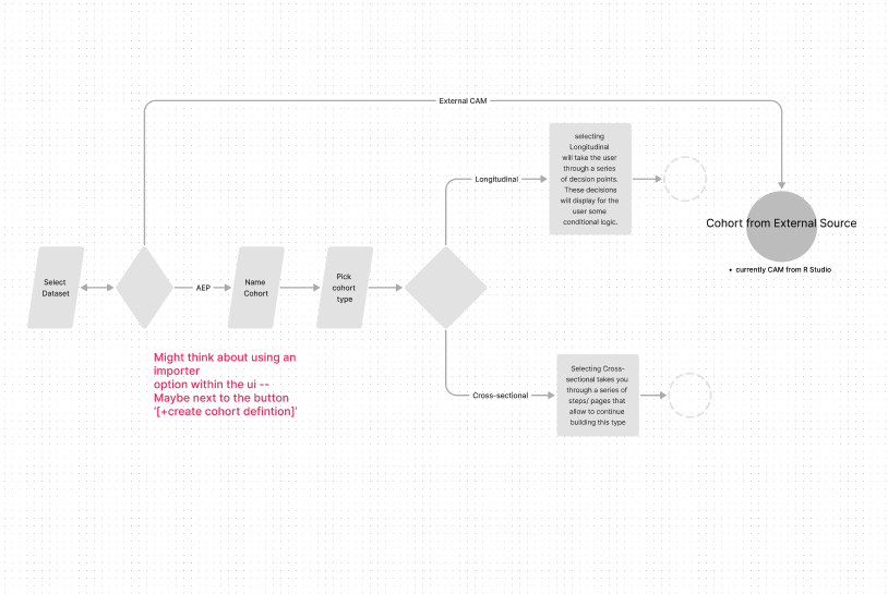
Quick flow that illustrates an early discussion. This flow was taken from requirements from PRD document as a basis for task flow.
Learn the Objective
During this discovery phase, product design worked directly with all stakeholders to learn about the business needs and product requirements. We were presented with the PRD in detail by the PM, and provided the opportunity to ask detailed questions. The objective was to increase efficiency for epidemiologists and analyst users as they defined their populations (cohorts).
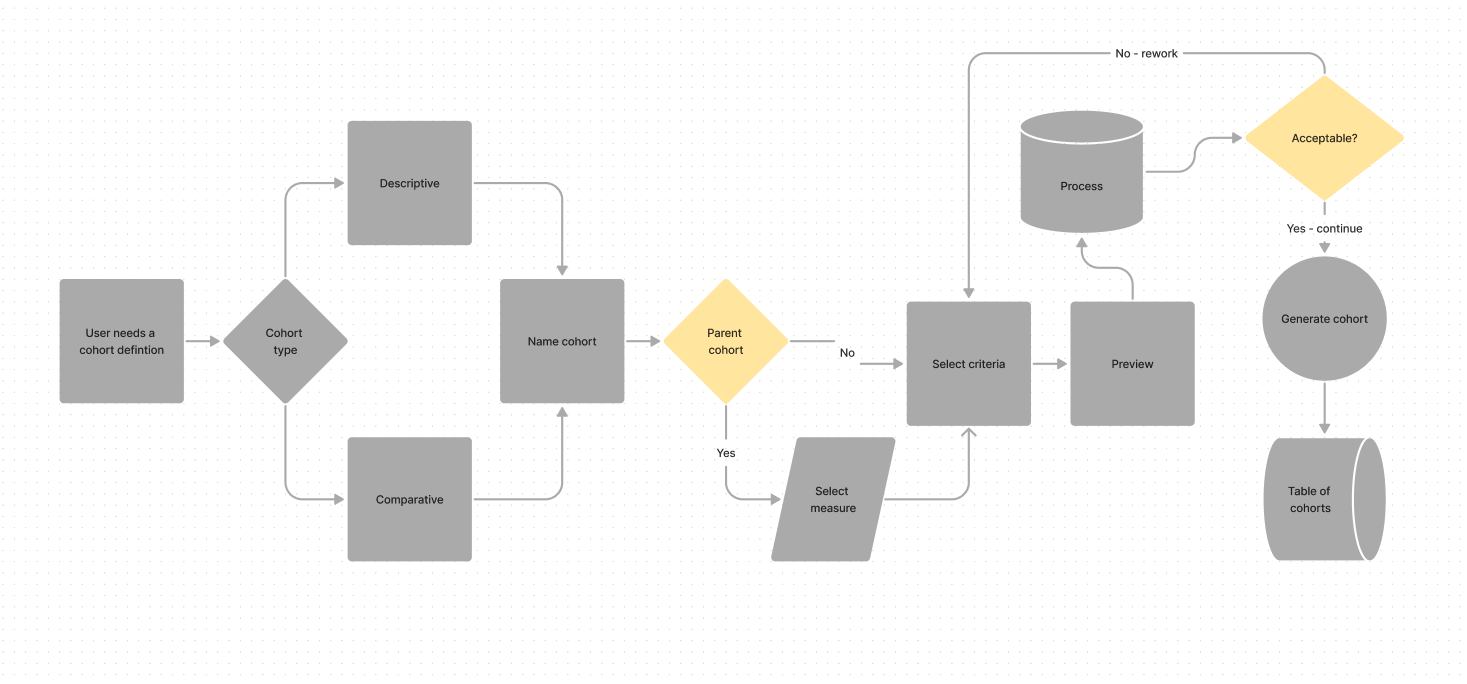
High level flow to illustrate proposed flow.
User Studies
The objective of this phase was to understand how current users use the product and ask them questions that might allow us to learn more about their pain-points — specifically in terms of cohort definition. We accomplished this first through individual user interviews with internal users, then secondly through a more comprehensive workshop (Figjam) that allowed design to playfully understand what some of these pain-points really were.
During this process/ stage of design, I focused on understanding some of the more specific task flows. This was an opportunity for participatory design with users to kick in — instead of translating users’ words to flows, we collaborated in fleshing out ideas. In many cases, this allowed users to interact with each other and provide more insight.
Design objective was to validate that the PRD did state the problem users were experiencing.
Secondary navigation, below the work area, provides more guidance to the user through the complex setup process. This works in tandem with the sidebar’s steps sequence.
Explore Solutions
The Aetion platform in its current state of cohort definition used a sidebar to guide the user through the series of steps as they defined their population. We found through our conversations that the users would get through a few steps (choose the cohort type, choose the dataset, name the cohort, select a parent cohort, etc.), and realize that as they were making some of these decisions that they would be locked into a ‘siloed’ flow, one where there was no return. So, if they decided that they made a mistake, or changed their mind early on, there was no way to back out without starting over.
This insight allowed us to begin thinking through an interaction design that involved conditional logic, one that permitted users to step in and out of decisions — making it more flexible. We created a wireframe that illustrated this line of thinking and presented it to a few internal users. The feedback was received positively but with a little more feedback that enhanced the design vision - for example, to also add a simple back and forth navigation system beneath so that users can move back and forth between flow steps. We added three iterations of our solution, some with and some without the navigation, then presented designs to the product team for review.
Design objective was to problem-solve the primary question from the first step, and to provide task flows, high-level designs, and user flows.
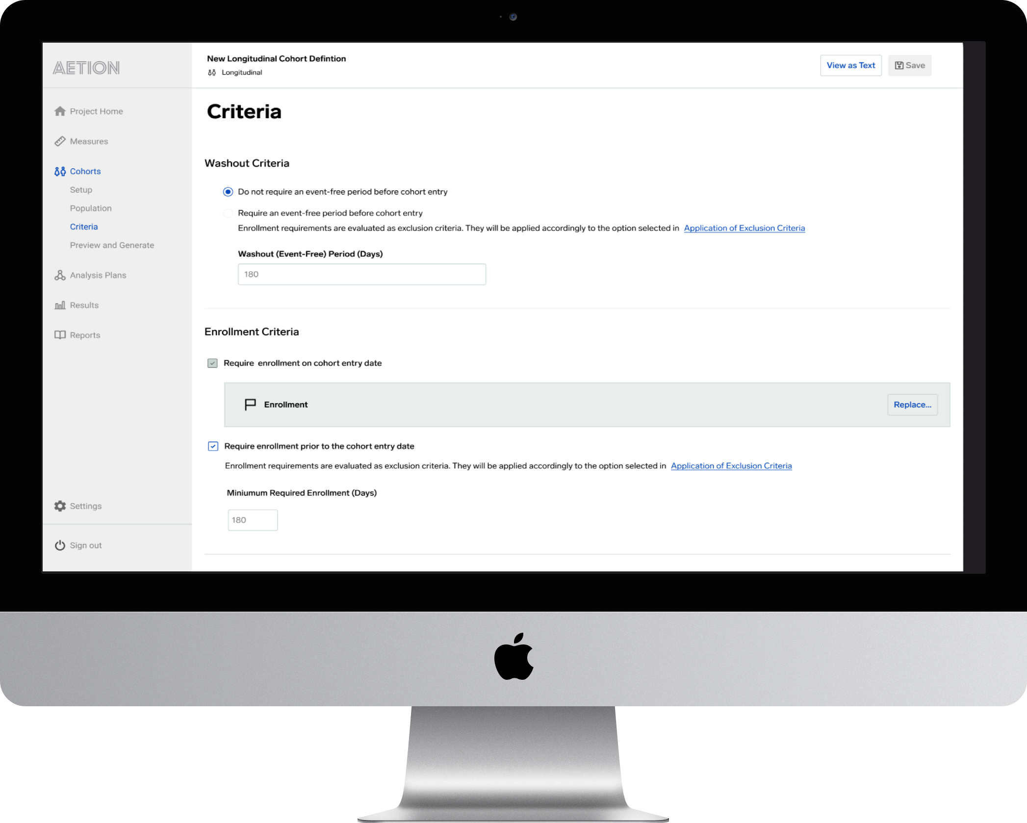
User flow within the criteria screen that displays washout criteria being more flexible with radio button configurations. Previously, the user was locked into hard coded settings based on the type of cohort definition the user was working with.
Technical Feasibility
Upon obtaining sign-off on the design, I reengaged with the engineering team to gather technical feedback, we also had one of our internal scientists at the meeting to help explain more technical considerations. The deliverable for science was a wireframe series of user flows that highlighted the proposed interaction design. I put together three variations that had similar flows, but some of the flows sidestepped some of the decision points, which helped reduce the number of interactions a user would need to undergo to meet the objective.
The engineers provided clarity on how the current application functioned — how the system was able to retain user input, or in some cases, was unable to retain that user input. This feedback was mostly based on their understanding of the subnavigation and how it functioned from step to step vs. page to page, some of these changes would be global, and how would those be addressed. Engineering stated that the backend was not ‘coded’ in a way that would allow for easy re-factoring and would scope creep this particular project. Since the product manager for this project was involved throughout every step of the process, she was able to handle that right away.
Design objective was to determine the version with the smallest number of interactions.
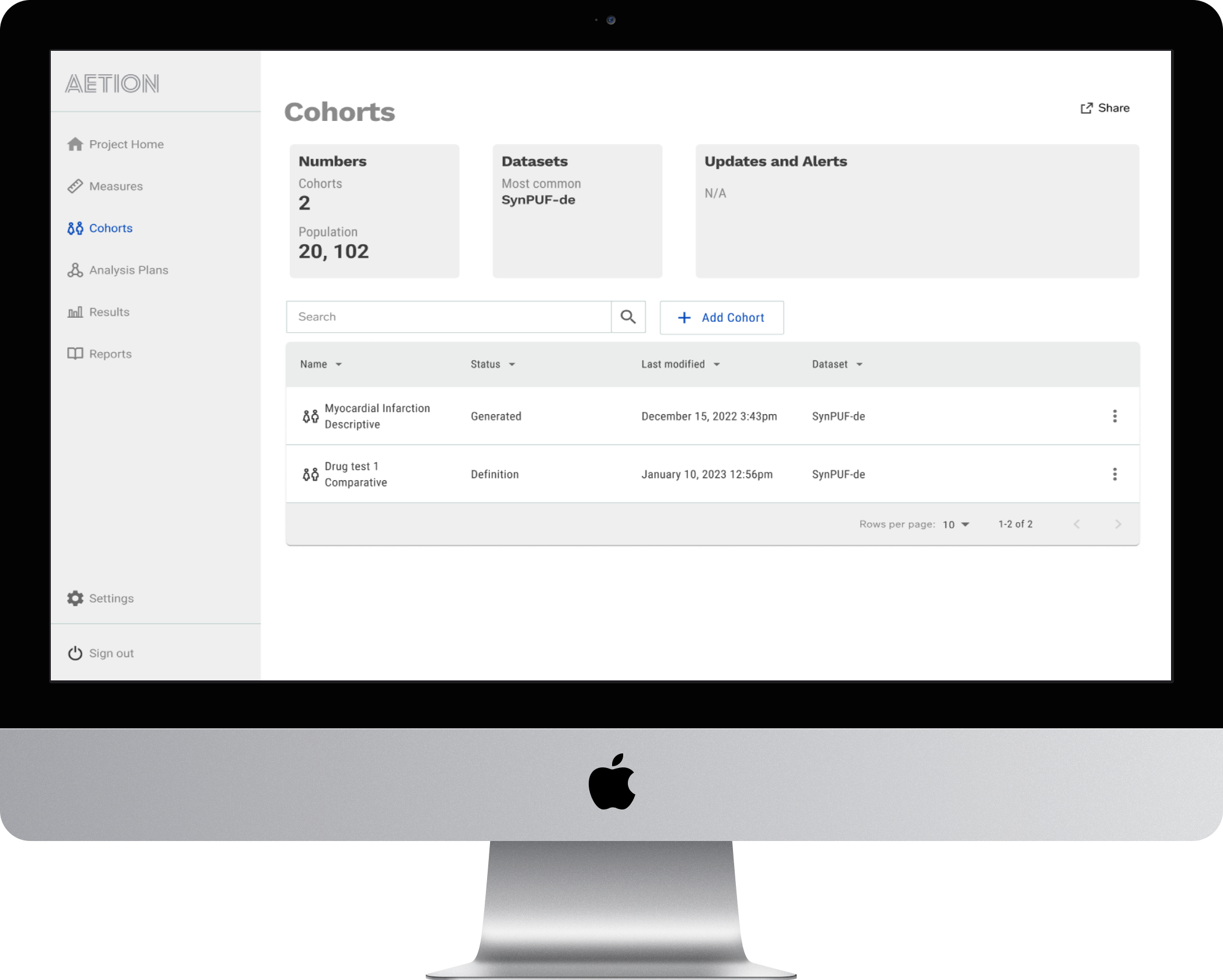
Cohorts Dashboard allows users to understand what they have and what they can do instantly.
Design and Test
With the PRD completed, our flow was validated by epidemiologists (users) and engineering. Then we began work on completing the designs. We continued using Figma, but also leveraged our design system and component library. Since our design system provides templated pages, fleshing out the completed designs with a higher fidelity version was relatively simple, and I was able to focus on components and task flows.
Task flows were converted to high fidelity user flows that were shared across the appropriate collaborators (FED, Eng, PM, QA, Content Strategy -UX). Feedback was integrated into our Figma through the comments feature. Jira tickets were created by the PM for Engineering and Design. Daily standups maintained consistent communication and prevented any bottlenecks in our process.
The design process was broken into design sprints that ran 2-weeks ahead, and alongside engineering. This design from a roadmap perspective was to be completed by the end of Q2 2023, this became our design delivery target.
Design objective is to complete high level design (protoype with all flows from requirements) and test with users to validate if there were any fail points.
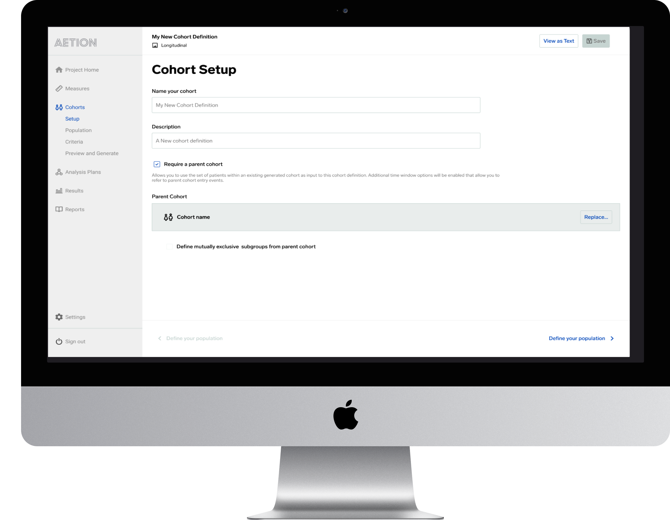
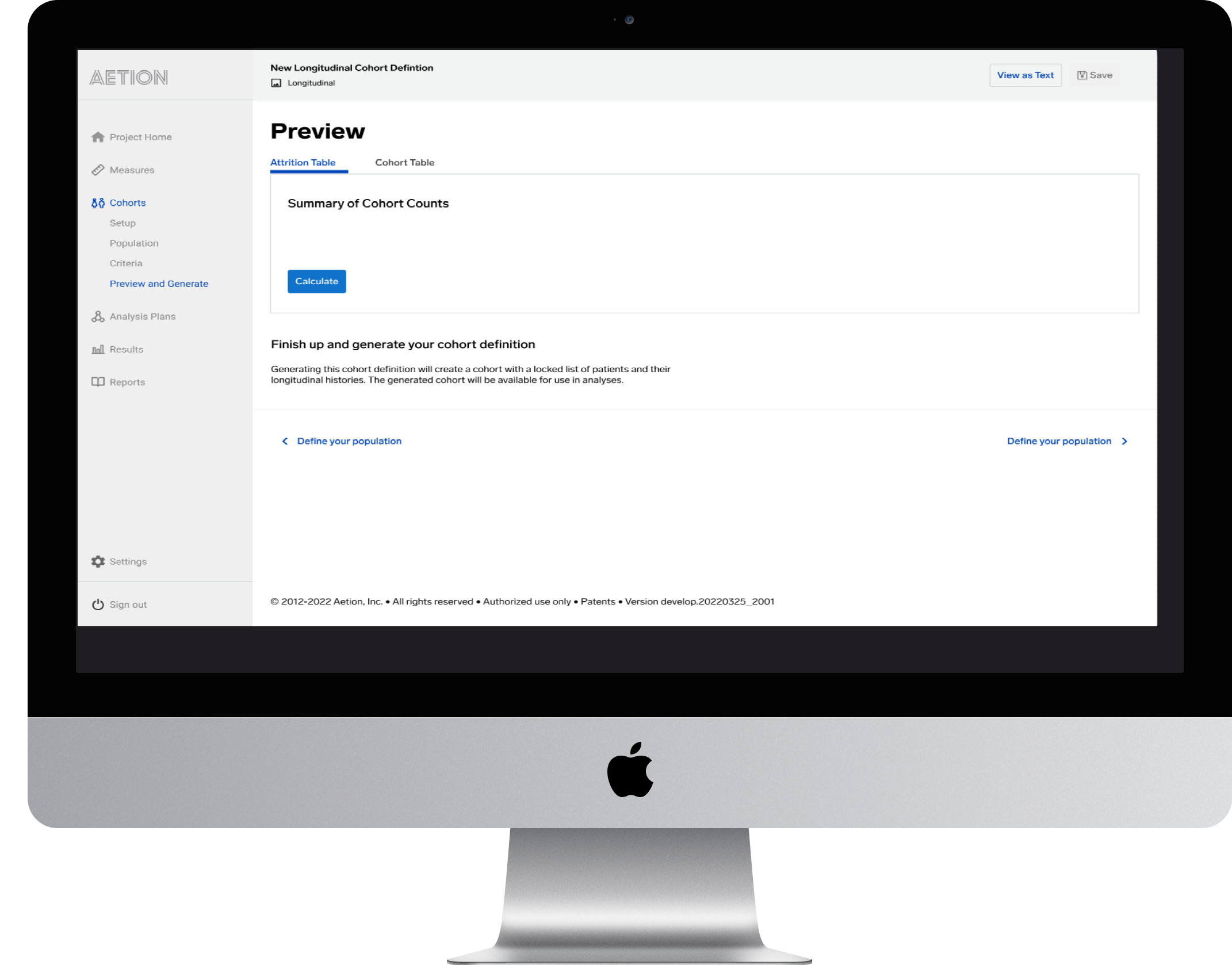
The initial cohort setup screen
Deliver and Evaluate
Early qualitative data suggests that the changes we made did impact the user experience in a way that reduced duplicate work, increasing productivity. Thus far, it is too early to evaluate quantitative success in a realistic way, this will be evaluated in a quarterly Design/ Product engagement meeting. One interesting side note is that the changes we made also reduced backend costs on processing charges since each generated report was another charge.
Design objective to provide high level designs and evaluate success through quantitative methods such as metrics gathered from Pento; Qualitative methods such as user surveys, and interviews/ focus groups.